Point of purchase opens every brand with the opportunity where it can engage with shoppers. As one of those brands, you only have a fraction of a second to make an impression on passersby on grocery shelves, and you must make that moment count.
By getting customers’ attention with your POP displays successfully, you can increase your sales without spending more.
There might only be so much you can do with point-of-purchase displays, given that they are printed materials and might burn a hole in your pocket. However, all you need is creativity to get more eyeballs on your products which could result in greater purchases.
To help get your imagination up and running, below are point-of-purchase display examples. They can give you ideas on approaching your POP displays that match your brand.
Centrum: Shelf-Takers
Also known as hang tags, they appear on grocery isles where you can find products on the shelf. They help direct passersby where the brand for a particular type of item is.
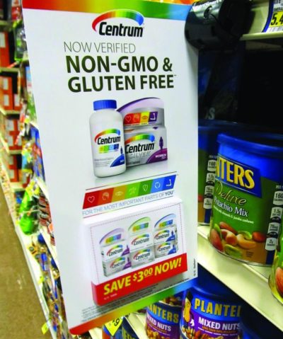
In this example, Centrum vitamins are now non-GMO and gluten-free, as shown in big, bold letters. Customers will also see the appearance of the packaging to identify it from other Centrum products.
The main catch of the display, however, is the coupons at the bottom. People can get one to save $3 for every purchase of the products.
Another interesting thing about the display is its placement. You’d expect it to appear along the aisles where people can find vitamins. However, you can see the display in the snacks section where brands like Planters surround it.
However, the placement may be deliberate. Whenever shoppers are looking to buy snacks, the display will remind them of their health. This could lead to them getting a Centrum using the coupon before checking out.
L’Oréal: End Caps
End caps are arguably the best places to set up a display for your brand. Displays from this part of an establishment are the first thing people see before going down the aisle. They are also large enough for people to see from far away.
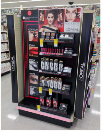
This example for L’Oréal shows you how eye-catching end caps display can be. The brand took advantage of the space by printing out the tagline “The World’s #1 Facial Skincare Brand” along with graphics to match. More importantly, it stocks its best products there so shoppers can get their hands on L’Oréal before they can even check out other brands on the shelves.
Tic Tac: Sidekick Display
Also called a power wing, sidekick displays allow you to efficiently maximize product sales by placing them near areas in the store with the highest foot traffic.
These small hanging cardboard displays mostly hang on the side of end cap displays, but they can also appear near the cash register. And due to their size, you can easily find space to showcase them.
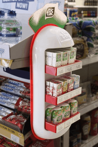
You’ve probably seen sidekick displays of Tic Tac in your local stores before checkout. And there’s a good chance you grabbed at least one to include in your purchases. This quality of sidekick displays makes it one of the better choices to feature your snacks and small food products. It also doesn’t hurt that Tic Tac has a sleek and attractive-looking display that stands out. The display takes shape and color of the ever-popular and recognizable breath mints.
Pringles: Gravity Feed Display
This display type is a great way to showcase products with unconventional packaging or those in-cylinder canisters. What this display allows is stacking your products from top to bottom. Then, there is an opening in the display where shoppers can get the item. Once they pull it out, another item drops in its place.
A great example of a gravity feed display in action is the one from Pringles.
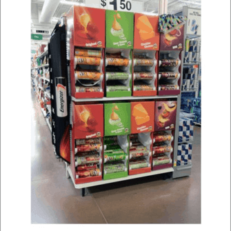
As you can see, whenever you take a Pringles can from the display, another one rolls down to replace the one you just took. Therefore, instead of stocking them on the shelves, gravity feed displays let you showcase your products uniquely and memorably.
Motril: Floor Display
This display type is a space-saving way to make people notice your brand in stores. Floor displays don’t protrude along the aisles and stick out like a sore thumb. On the downside, since they appear exclusively on the floor, it will be a bit more challenging to get people’s attention.
However, floor displays are very effective if you get creative with them. A perfect example is this display by Motrin.
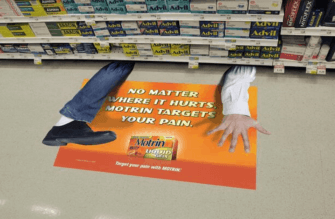
Motrin is an over-the-counter pain reliever brand. It’s arguably not as popular as Advil and others, but it is just as effective. It’s just a matter of marketing it properly and raising more awareness about the brand, which is what its floor display did.
The image of a person squashed by the aisle is a lighthearted way to communicate its message. The copy also helps show the effectiveness of the pain reliever.
The placement of the display feels strategic as well. The bottom row of the aisle shows Advil products. So, whenever people bend or look down for them, they can’t help but also see the Motril display.
Bulleit: Free-Standing
Unlike other displays in this post, you can promote your brand using free-standing without a shelf or wall. This way, you can choose whichever location you wish in an establishment to maximize your brand’s impressions from customers.
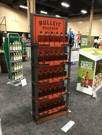
The great thing about free-standing displays is that there is more freedom for you to fashion your brand around it. In this example, Bulleit has a relatively simple design for its display. But what makes it stand out is the design that matches its brand. The rustic colors of the display capture the feel of the product, which also helps customers decide whether to try out the product. The appearance helps tingle the other senses.
Kit Kat: Dump Bins
There are products that shoppers don’t list down as part of the essentials, like candy bars and small food items. However, these are also the easiest to sell if done correctly. Dump bins allow you to do just that.
Just like free-standing displays, you can set up this type anywhere in a store without needing shelves. With the right design and setup for your display, you can encourage impulse buying from shoppers even if they’re not actively looking for your product.
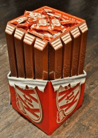
This Kit Kat dump bin display is the perfect example of impulse buying. After buying groceries for the family, it’s time to do something nice for yourself. Therefore, a pack of Kit Kat is in order. With its design resembling what’s inside the pack, it’s hard to resist this offer.
Scotch Tape and Glade: Pallet display
If you want shoppers to see your brand in full display, then the pallet display is for you. They are as big as they come and are impossible to miss. They come in different sizes: full, half, and quarter – the first one being the biggest.
Aside from its size, another advantage of pallet display is that it also works as its transport packaging. Therefore, once the store receives the package, it can merely unbox and display it without little to no set up involved.
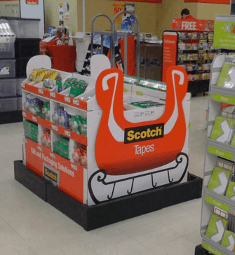
This example by Scotch Tapes shows how brands can use this full pallet display to its full effect. Since it occupies a lot of space inside a store, you can put as many products as you want of your brand. This way, you don’t have to stock them in the aisles along with the others.
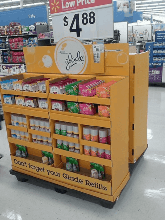
Half-pallet displays achieve the same effect as a smaller scale. In this example, Glade holds different Glade products in a single display. It also carries refills complete with the text below the display. This part works to Glade’s advantage because people will want to buy as many refills as they can so they don’t have to come back again and again.
Conclusion
There’s a lot you can do and achieve with the right point-of-purchase display for your brand. Remember that some products work best on specific displays, so consider which display you should use based on the examples above.
Also, be creative and come up with unique ideas for your displays. Ultimately, what captures people’s attention regarding these displays is how much you can say about them despite the limited space. Of course, you need the display to be in line with your brand. You don’t want to showcase your products on displays that aren’t in line with your brand mission.
Finally, the displays need to be made from high-quality materials. It’s all too common for pallet displays, for instance, to break and tear because they can’t carry all the products on their shelves
With our POP display assembly service, we can also deliver on time based on your specifications and volume. This way, you can feature your products prominently in stores without worrying about the display’s quality.
For more information on how we can help you, click here and fill out our quote form.

Great collection of images Randy! Particularly loved the KitKat one. It is visually appealing and memorable. Also the Motril floor display one is good… humor goes a long way to increase a brand’s recall value.